In-spite of the crazy world of first half 2020 your Quad Area Chamber Board has been busy, learning and adapting to a new way of doing business and supporting our members. As we adjust our programs, and put together plans to help the businesses in all 4 communities recover and grow, we decided to start with a fresh logo and brand. A local graphic artist has offered us 4 options .
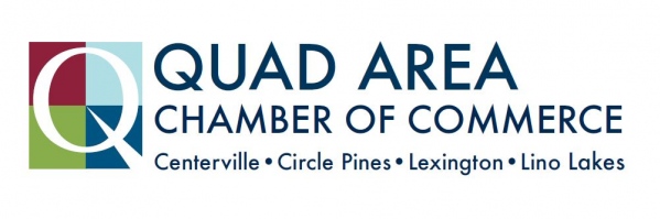
Option #1
The letter ‘Q’ (taken from the word ‘Quad’) is constructed from the four community colors representing Centerville, Circle Pines, Lexington and Lino Lakes. The tail of the letter ‘Q’ is in the form of an upward arrow, signifying that the four communities are growing and aiming toward the same goals together.
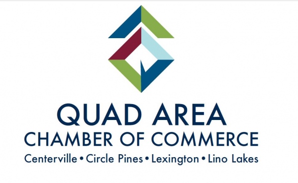
Option #2
The addition of an upward chevron to the first design emphasizes stronger movement toward common goals among the four communities.
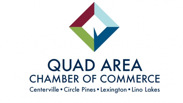
Option #3
The four prominent, symbolically colored squares emphasize a strong relationship between the communities. The ‘Q’ is constructed from negative space, with its tail rendered as a prominent upward arrow signifying growth and progress toward common goals.
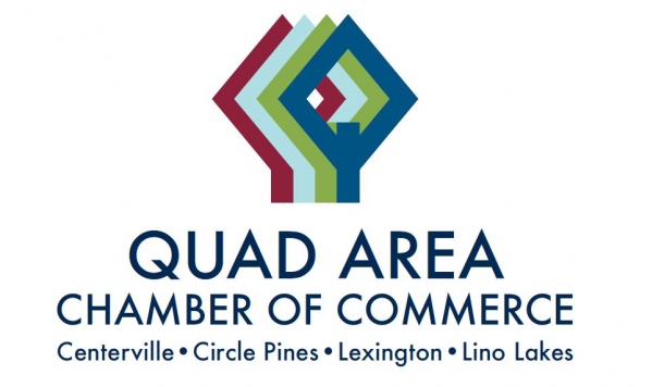
Option #4
The four angular, tree-shaped ‘Q’s are rendered in a way that evokes a sense of neighborhood and community growth. The diamond shapes further express upward movement and progress.